Monday, December 3, 2007

t-shirt


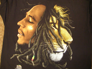
the Bob Marley and the lion t-shirt. i like how the designer combines both heads together with the hair and also how their facial expression is portrayed and almost looking similar.

ecko shirt.


this is an ecko unlimited shirt. i posted it becuase of the trees in the background of the typo which you can barely see since the entire shirt was designed in shades and tints of green. a great way of creating depth.

graphic dig class


this is a poster i did for my graphic design finals. the concept was based on a jamaican movie called shottas, the assignment was to watch a movie and use 5 key visuals in the movie to make desgin a poster.

Thursday, October 11, 2007


i think this is an ad of an internet designers corner. i like the way the woman is been shot from the back view so the audience will have an idea of the ad being about graphic design since we are also starring at the computer out of focus. the viewer is also included in the ad from the position of the image since the back of the woman is in focus showing the color pencils in her hair which could mean she was working on a design outline.


i don't know what this front page cover of the communication arts magazine ad means but it sure does remind me of a horrific halloween image. i came across it in one of the 07 editions of the magazine.

i don't really know what this ad is about but i think its cool since it has hand written text and an image of a person with his upper body covered in tattoos which is another form of art. i'm also thinking its a body arts ad.


this is another cover of one of the 2007 communication arts magazine i found in the parkland library. i like the graffiti look the design has to it and also the vivid colors used to attract the viewers attention makes it hard not to notice the design.

this is an ad i wasn't sure whether its advertising a sucker or the sucker is been used to represent the actual product been advertized by the Kromekote collection. After reading the text i think its a fashion ad.


i was attracted to this ad i found in the adbusters collection by the composition. i like how the image is centeres but your eyes still move around due to the blue at the top and the buttom.

one of the covers of the cmmercial arts of 07 front page cover. nice gesture of the figure.

a poster i found in the adbuster magazine.


Well emphasized ad by placement and focal point. The designer also did a great job of unifying the entire piece with the color of the backgorund which tends to appear in several parts of the images as well. And also the choice of texts used really add a feel of early tweenties kind of feel to the ad.


this image is by Damien Correll i found on at google. the 3D ribbon looking text was what cought my attention about this image and also the background and the choice of colors which i think works very well for the piece.


the firts thing that came to mind when i was tsearching the internet for graphic design images was this is a perfect example for an ad becuase its beasically text and how the word Type has been emphasized by size and the color and also how the poster is symmetrically balanced by the text.

the image reminded me of a dadaism and cubism work piece due to the overlapping and the monochromatic cubic shape in the background. this is an Elvis Costello poster for a theatre show.

this is a ad of a dance school called egrafica i saw on google the other day. i was attracted to the image due to the images and the text arrangement. And also the the background color unifyiing the entire piece.

Wednesday, October 10, 2007


i found this image on the internet about a graphic design company. i liked the airbrushed looking edges and the composition of the entire poster being half black and white with a bright sun rays looking background. the airbrush feel to it reminds me of A.M. Cassandre's work during the art deco period.


this is a poster i got from google. its basically about adidas soccer. it has the face of david beckham on one half and the adidas theme, impossible is nothing on the other half. its interesting becuase the poster is not just to sell adidas products but also to promote american soccer, thats part of the reason why i chose it.

Tuesday, October 9, 2007

the compilation

i like the compilation of different images been brought together. the different images work together with the typo and the color.

Tuesday, October 2, 2007


This image clearly defines the visual meaning of perspective. it also has both elements and principles of design such as line, shape, contrast, balance, and rhythm. the angle of the shot worked very well in capturing the perspective view. When i look at this image the makes me want to listen to a orchestra, with fast progressive changes in pitch as the music builds up.
color contrast


The contrast in color plays a big role in this art piece by Shinbi. The composition is very smartly done by having the vodka bottle in the foreground making it the most important object in the piece. And also having the other two bottles in the background. I must say this mordern art style is very vibrant and can surely pass for a bill board or a commercial on tv.

black history poster


this is an image of a poster of black history month i found at the deviant art website. It is a very interesting poster due to the the placing of the images and the text expecially the freestyle in bold on the upper left corners. and also the red helps create emphasis on the map the mask and the messagge in the text.